(http://designshack.net/articles/typography/60-absolutely-stunning-typography-projects/)
On Tuesday's lesson, I learnt about typography and its basic functions!
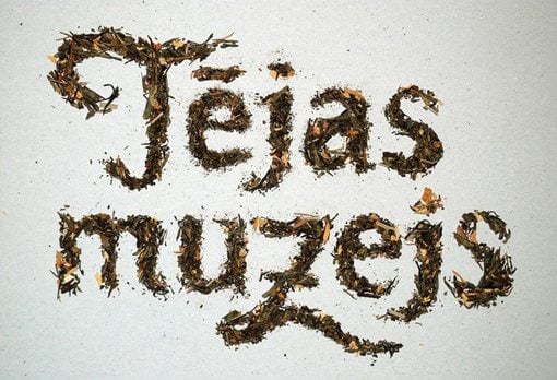
What is typography? Typography is the art and technique of arranging type, type design, and modifying type glyphs. All forms of writing are typography. There are 8 rules for creating effective typography.
#1. Learn the basics
Typeface involves very specific jargon, general standards and precise measurements. You can only get away with breaking a rule if you know it well enough and are doing it intentionally.

Adjusting the spaces between two letters are called kerning. This means I can edit each letter individually.
#3. Be aware of font communication
When selecting a font, I must be sure that the font will be suitable with the word. I can't pick out any font carelessly as this wont produce an effective result.

(http://designshack.net/wp-content/uploads/TypeMasculinity-9.jpg)
#4. Alignment
Beginners usually just center align everything due to thinking balance produces the best result which is completely wrong. Alignment is an extremely important concept and should be used selectively.
#5. Choose a good secondary font
After choosing the main typeface, I will have to choose another font that will complement it well. I will avoid using fonts that conflicts with the primary font.

(http://designshack.net/articles/inspiration/100-awesome-logos-with-script-typography/)
#6: Size matters
The headlines are essential to grab the reader's attention instantly as there's limited time. To do this, dealing with the different sizes of the words will definitely attract them.
#7. Use typography as art
Typography are not simply headlines and body copy. There are design elements to it and it can be meticulously designed as meaningful art. It can be a valuable asset to my design arsenal.

#8. Find good inspiration
Inspiration comes from everywhere and it's best to study some existing examples for more ideas. Keep a lookout for inspiration.
GOOD TYPOGRAPHY:
Good typography should be appealing to a person's eye such as big sizes, colour contrast and many more. The typography must be clear for us to understand quickly. It's supposed to give meaning to the advert. By using it as art, it make the whole advert design even more attractive and unique.

This is definitely a unique typography from IKEA. It is simple and fun. The words of "Coffee table" are misspelled as "Cfofee tbale" to imply that you can build the table your own, just as how you had to rearrange the letters correctly. The copy "Make Home Fun" just states how fun it can be to build your own furniture at your own house. The typography is fun and easy to understand. It definitely grabs a person's attention as the size are big and the colour contrasts against the white background. The misspelled words will catch someone's eye. Overall, the typography is flawless.

(https://blogger.googleusercontent.com/img/b/R29vZ2xl/AVvXsEitmMtd4wovDOvsvROko5DDJjZPzSmiwHbM9NyaE8ozmWNV12Gm4zV42LTIqNDRPL_85Ik9oguIAhyphenhyphenqJmtPeASf_zDrSvR7XTeQ_MnanNlNR1TVaTxzk2QK_Jqq86L8977d9ixtjJdm3JD6/s1600/typographic-print-ad-03.jpg)
Using a lemon as a typography for a Coco Cola Light Lemon drink is absolutely genius. It is simple, unique and creative. The lemon is cut perfectly to recreate Coco Cola's "C". With one glance at the advert, I can already tell that this is selling Coco Cola lemon flavour. Overall a wonderful typography!
BAD TYPOGRAPHY:
There's nothing much to say. Bad typography is simply bad typography. It isn't clear with what it's trying to say, it gives the wrong meaning to the advert, the colours and fonts are wrong, the message is bad and pretty much everything is bad. It will definitely not appeal to anyone and will fail to help sell the product in the advertisement.

(https://blogger.googleusercontent.com/img/b/R29vZ2xl/AVvXsEgPl5CPCFmQt_l_Qgs2AUr0ONQJ-3gxvuGVqIzfNbxZJLcYbBHZ5stvMi-3DOcXgTNj7YeMimeRc6cKcILWt61lCKaXJq3Q0Uo_fN7Z4Qd2i3u1xH1U9g0XL3FpDWkEI8d7KViioedhQ3E/s1600/bad+type+2.jpg)
This is inevitably a bad typography. The spelling is horrible and the different sizes of letters makes the whole thing even more horrendous. It is also really rude to use "Oi" and it'll make anyone not want to do anything with it. It has no meaning and won't grab anyone's attention at all. Typography like this is a failure and I will take note not to ever do this.

(http://typophile.com/files/bad%20type%203_5210.jpg)
There is no space between "Kids" and "exchange" so it implies another meaning. There's too many colours and it hurts my eye. Definitely a bad typography.
No comments:
Post a Comment