Keeping the layout simple is a very basic design strategy such as the Ogilvy Formula. Visuals on the top that are bleed to the edge of the page, caption below, headline next, an ad copy and finally the signature in the lower right corner.

(http://www.gutewerbung.net/wp-content/uploads/2013/03/Nissan-Cube-Symmetry-sucks-3.jpg)

(https://m1.behance.net/rendition/modules/39679685/disp/ecc5eb70e659c649805a9f433e38f83d.jpg)
The different principle of designs definitely applies to the design! For example balance (symmetrical and asymmetrical)

(http://gdj.gdj.netdna-cdn.com/wp-content/uploads/2010/07/poster-designs-22.jpg)
Next is contrast which uses different shapes, type, lines, sizes, images and figures which captures the eye. This is to emphasize the key points you want to show.
(commissionedwriting.com)
By using proportion, we are able to create emphasis on important ideas or figures. I can do this by making the key points larger, bolder, striking, basically different from the rest of the elements of the advertisement.
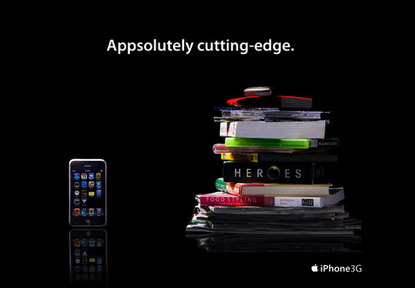
(http://tyneesh.files.wordpress.com/2011/01/proportion_21.png)
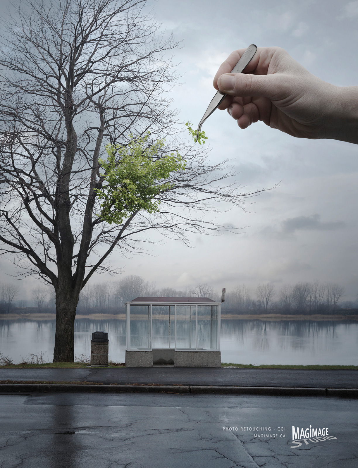
(http://williamaaronkelly.files.wordpress.com/2012/01/magimage_arbre_adsoftheworld.jpeg)
Those are the basic design strategies to keeping the layout simple. To step up my game, I can use a variety to make my advertisement even more interesting instead of a mirror-like symmetry type of design. I will carefully select the backgrounds and I can use the golden rectangle. These are the advanced design strategies. The grouping strategy is by using similar shapes, sizes, colours and textures. It can merge ideas in one, twos or threes by finding relationships and making them obvious.
When talking about colour, it is best to avoid black and white as it is boring (depends on the concept of the ad). Colours are exciting and there are different meanings to each. Colours are able to create desired emotions such as passion, peace and love. Harmonizing, balancing and contrasting colours will make the advertisement pop out.


(http://slodive.com/wp-content/uploads/2012/06/creative-advertisement-posters/my-advocacy-ads.jpg)
Photo design and layout strategies are centered on two ideas which are making the mind group things to increase communicability, and bring items in and out of focus to emphasize importance. I must take note the best proportion, details, central points, linkage and point of view of the before taking a photo. Having too many ideas might be too much for the photo so it's best to cling to only one idea: Using the rule of thirds, use shadows and light, and play around with various kinds of lighting.
The things to avoid while taking a shot would definitely be harsh shadows and gimmicky background (ripples, crumpled folds, busy patterns) as it may be a distraction and the central idea would lose focus. Background colour such as gray or black is also important as it can act as a contrast. By using visual stepping stones, it can capture a person's eye to the inner details of the photo. Framing the photos with objects or shooting on location gets a greater sense of reality.
When cropping photos, using principles of "closure" will carefully plan fashion shots. It is recommended to shot the product as if you are in love with them. It just makes the photo even better. If people are included in photos of products, they should be able to show the right facial expression needed in the photo.

(http://media-cache-ec0.pinimg.com/736x/c9/7d/39/c97d393645742186b3005618696dc223.jpg)
(bonesi.blogspot.com)

(http://files2.coloribus.com/files/adsarchive/part_1504/15041405/file/pilot-pens-pen-fashion-poster-600-27719.jpg)

(https://m1.behance.net/rendition/modules/67095969/disp/ba65e691dadd20407096ce6a29fd7eb2.jpg)

Those are the basic elements of a print advertisement! I will make sure to use the principles of design and the various strategies for my assignment 2. I will also take note to keep the purpose of the ad in mind as that is the most crucial part.
No comments:
Post a Comment