Friday, August 8, 2014

It's almost the end!!!

It's almost the end of this assignment and EGD! Time flew by so fast, it really doesn't feel like a whole semester at all. I've been working on my newsletter and should be about 60-70% done? I'm not so sure myself, haha!

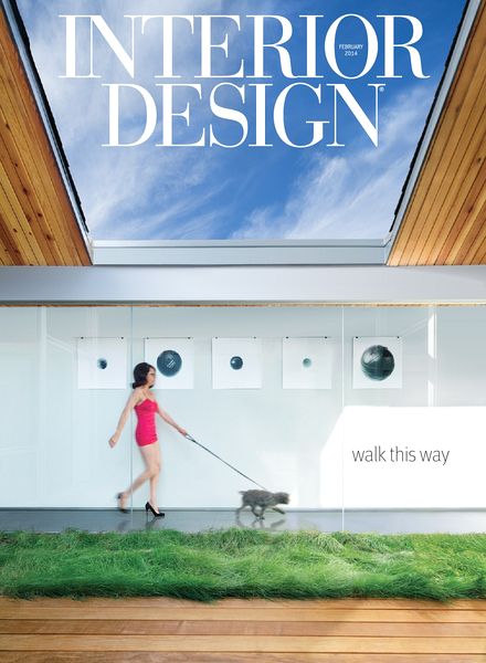
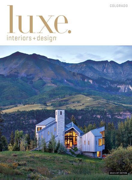
My layout is pretty simple unlike the rest of my group mates. Theirs are really looking awesome and I'm looking forward for the completed result :D I went for a normal two column type on one page and just a large picture on the other. To give it a little twist, the shapes of the photos are all different to give some variety and depth instead of just boring shapes such as squares. 


But then, I think my design is pretty playful due to the fonts I used and it doesn't look like it matches an interior design newsletter, so I changed it and even made the photos a tad bit smaller because it looked too big.


Even then, I'm quite disappointed at my progress. I tried to use some newsletter designs for more inspiration but even with all those interesting designs, I can't seem to make mine look as nice as those! Above is the progress I'm currently at. Honestly, I'm not happy with it because it doesn't look like a newsletter at all! It looks cluttered but it looks plain at the same time. I'm really trying my best to think of what's missing, but I don't know and I'm really annoyed! I'm fine with this but it really doesn't look that good :') 

Maybe I should highlight the headings for more colour? Maybe I should change the big picture or it's probably the fonts. Am I doing this right? I'm not even sure! It's alright, I'll find the solution to the problem no matter what :) Another thing I'm worried of is my group's flow. I'm afraid the newsletter won't flow as well as we planned it to be. However, I don't doubt my groupmates' capabilities! I believe we can make our newsletter as amazing as those we found online ^__^

InDesign has definitely made me doubt myself multiple times. It's supposed to be easier than Photoshop but personally, that's not true at all! Of course, I won't give up and will continue doing my best. I may only have a few days left but that's more than enough time to make everything better than before :D

Hopefully, we can achieve great results for our group assignment! Wishing all the best to all groups <3 (and mine too, haha!) 

Thursday, August 7, 2014

Working on InDesign

On that day, I started on my layout on InDesign. It didn't take that long as the brief layout was quite simple to do.

Then, I started finding photos of Industrial interior design. There were so many beautiful rooms I had a hard time choosing! These are the few examples I found. They were all so spacious and has an industry feel to it, I was so excited!


Furthermore, I wanted to put the small details that makes a house industrial hence I searched for those items such as the rustic metal, lightbulb pulleys, pipes, paint on walls, bricks and so many more. 

  breadwinner - pulleys and light bulbs   .  for my magazines

After finding photos, I remembered I had to find the text! I completely forgotten about the text and realized I got the formation wrong. I should have find the text first before the photos to make sure the content is related. But it's alright, I got over that and searched for the a few articles on industrial interior design. It was quite difficult because there weren't much I can find that is good but fortunately, I found something that I can relate easily to the images found!

I will be using this article as my content! 

So far, after adding in the text and such, I realized another thing! My group and I haven't decide on the fonts and sizes used! There were many other things we have to decide on so we'll work on those things immediately. 

For now, this is how my layout looks like. I still have to photoshop the photos to change the effect and add in more text. I'm quite alright with it but I hoping to do even better than this. I'm still getting used to InDesign and will definitely try harder! 


Sunday, August 3, 2014

Layouts & Sketches

My group and I have decided on the layout theme which is slanted and large photos based on this magazine:

(http://cdn.inspirationhut.net/wp-content/uploads/2012/09/Magazine-Layout-Design-Inspiration-34.jpg)

Interior design is really all about pictures, so we wanted an appealing photo shape instead of the usual squares and rectangles. In our opinion, the way the photo is cut slanted is so interesting so we wanted to use that style. For small photos, triangles would be the shape.

 Then, we came up with these sketches for our grids. We used the star diagram because the slanted lines could easily guide us. Fortunately, they were approved by our tutor therefore we can start on our newsletter on InDesign! We were also given the grid template which we were extremely grateful for!! :) Here are our layouts:
 (mine) (Alicia)

(Jamie)                                                                    (Cheryl)

I hope from here, we can create a beautiful newsletter!! I will do my best for my part and achieve great results ^o^

Thursday, July 31, 2014

Group development

For my group (Alicia, Jamie, Cheryl), we planned to do a newsletter on Interior Design because all of us love its clean and large pictures concept. We got so excited searching for the photos! Our target audience would be working adults, families and really anyone who is interested in interior design and want inspiration. For the whole newsletter, it'll just show the different types of houses such as industrial, rustic, modern and grand. I chose Industrial interior design because I absolutely love its metallic and spacious design.


(http://www.interiordesign.net/media/photos/67941-May-2014-Cover.png)
(http://www.interiordesign.net/media/photos/60240-April-2014-Cover.png)
(http://www.pdfmagaz.in/wp-content/uploads/2014/03/23/interior-design-magazine-february-2014/Interior-Design-Magazine-February-2014.jpg)
(http://www.pdfmagaz.in/wp-content/uploads/2014/03/21/luxe-interior-design-magazine-colorado-edition-winter-2014/Luxe-Interior-+-Design-Magazine-Colorado-Edition-Winter-2014.jpg)

Before sketching our grids and layout, we wanted to find inspiration from other magazine designs hence we researched online for our own pages. Once we find our favourite designs, we compare which layout is the best and use that design as a guide. 

For me, I find these layouts so amazing!

  
(http://inspirationhut.net/inspiration/modern-magazine-re-design-transworld-surf/)

(http://inspirationhut.net/inspiration/42-excellent-examples-of-magazine-layout-design-for-your-inspiration/)


(http://inspirationhut.net/inspiration/30-more-stunning-magazine-and-publication-layout-inspiration/)

My favourites are:


(http://inspirationhut.net/inspiration/60-beautifully-modern-and-inspirational-magazine-book-layouts/)

I absolutely love the colours and how they arrange the pictures, fonts used and many more! It's so beautiful, I hope I am able to re-create something as similar as this for my own pages :D

Saturday, July 26, 2014

Creating Book Files

It was a short lesson that day because I only learnt how to package every page together to create a book file. This is extremely important for my group newsletter assignment to be submitted in this format. 

A book file is a collection of documents that share styles, swatches, master pages, and other items. It makes everything easy as I only have to number the pages, print or export to PDF.

The style source is one of the documents added to a book file. It is the first document in the book and a new style can be selected at any time. The specified styles and swatches replace those in other booked documents when synchronized.

(https://cdn.tutsplus.com/vector/uploads/legacy/tuts/000_2010/323_indesign_style_using_book/Tutorial_inDesign_Book_05)

First off, create a new book. The panel, which is the working area (where you add, remove, or rearrange documents), appears and the file is saved with the file name “.indb” extension. Next up, just add documents to the book file. It is really simple to add the document. Cick the plus button at the bottom of the book, select the InDesign files and just open it. I can also conveniently drag the files onto the panel. If needed, I can change the order of the documents by dragging them up or down in the list, making it easy for me.

(http://www.edensart.com/assets/images_computer_articles/full/zen_id_book_palette_full.jpg)

It is also isn't that difficult to manage the book file. Each book file has its own tab. The icons in the panel indicate a document's current status: open, missing (document moved, renamed, deleted), modified (being edited) or in use. For closed documents, no icon will appear next to it. 

Finally, when saving a book file, I must take note that InDesign only saves the changes to the book and not the documents individually in the book.

For my group assignment, we need to export the book to PDF file. To do this, just choose Export Book To PDF in the Book panel menu. To create a PDF of the documents, select them and choose Export Selected Documents To PDF

(http://indesignsecrets.com/wp-content/uploads/2010/08/exportpdfinteractive.png)

Instead of Interactive PDF, I must be aware that it should be Print PDF instead.

Now that I know how to create and save book files in the format I need, I can submit the assignment with no worries!

Thursday, July 24, 2014

Style Sheets

The first part of the tutorial was a brief lesson on style sheets; the basics. The steps were straightforward but it is time-consuming and a lot of work. Despite all of that, it has its wonderful benefits. Style sheets are basically recorded format that I can use in my design. It is already prepared. It helps a designer as there's no need to apply the same type of formatting manually again and again. For example, I can have all my titles with the same font, size and colour because I have already recorded all this information. I can apply them with a single click. It works out perfectly.


The formats are already decided in advance for different text and objects. Using these style sheets is definitely a quick and effective way to manage formatting. I learnt that there are two ways to create style sheets.
1) Format text until I obtained the design I like. To create the style sheet, I will use text as a template.
2) Open the style sheet palette and create style which can be applied to pieces of text
Nevertheless, formatting text using style sheets is a two-step process no matter the approach. Firstly, create the style sheet then apply to the text.

Here are the different types of style sheets:
- Character styles: Font, strokes and fills, leading, kerning
- Paragraph styles: Controls character and paragraph attributes such as tabs, indents and spacing, paragraph rules and hyphenation.
- Object styles - Strokes and fills, text wraps and effects. They can also contain paragraph styles for text frames.
- Cell styles: Table cell attributes such as text strokes and fills.
- Table styles: Cell styles spacing and strokes and fills


At first, I thought the style sheets were unncessary because I can just change whatever whenever I want to. I totally changed mind when I understood why and how it works. It makes formatting so much easier and I'm glad I learn about this! Below is what I did for this lesson :D


For the second part of the lesson, I was given a simple exercise to re-create two pages of a book. It was easy to understand so I had no problems in doing this :) 
These are the pages:


Sunday, July 20, 2014

Type on path tool + Image in text

On this tutorial lesson, I did the same steps to re-creating a poster except there are two additional things I learnt: typing on a path tool and image in text effect.

Typing on the path tool was simple, all I had to do was draw a line using the pen tool and just type on it! Due to the line (which can be of any shape), the text will just follow. I find that really cool and will absolutely used it in my future designs.

Image in text effect was really interesting too! As I was doing this, I was really excited *laughs* It was a bit confusing at first when I first heard of it but then I found out how easy it actually is. Just type something, preferably using a font that is big and bold such as Impact > create outlines (take note to click on direct selection tool) > prepare the image and cut it > select the outlined text > paste into > DONE. (If I'm not wrong, haha!)

This is the poster I re-created:


Next, I had to re-create a difficult poster of Shakira. The first time I saw the poster, I thought 'Whoa, how do I do that!'. I knew how to do a few parts but some were quite confusing. At last, here is the completed result. I did my best!