Friday, May 30, 2014

Research on Assignment 2

For Assignment 2, I have thought of many different products which I would like to do. Uniqlo AIRISM, furniture, suitcases, food and many more. In the end I went with American Tourister luggage simply because I saw the advertisement in the cinema and thought "Wow that looks so fun!" Then, I googled the advertisements and found out how interesting and creative they are.


(http://www.americantourister.com.sg/images/home/1.jpg)
(http://files1.coloribus.com/files/adsarchive/part_1485/14855355/file/american-tourister-crush-small-29850.jpg)

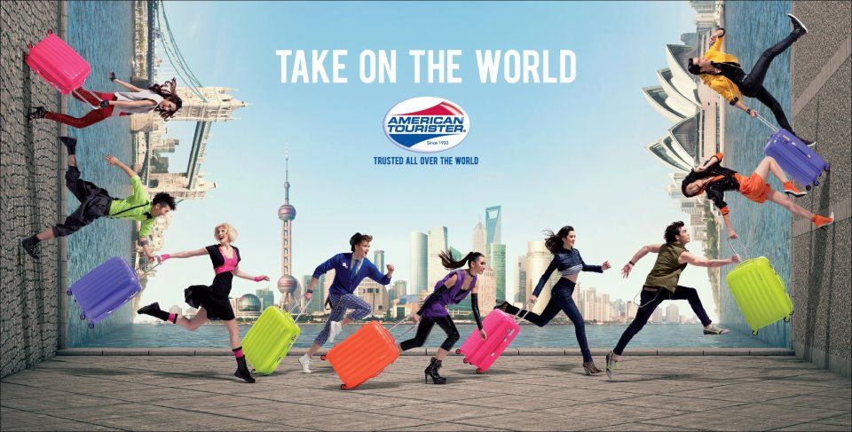
(http://i1131.photobucket.com/albums/m547/Its_Vns/Perfashionism3/take-on-the-world-american-tourister.jpg)
(https://m1.behance.net/rendition/modules/41170311/disp/c1e4613e8229f148e669b003e67dfa5c.jpg)

From the website, I found out Vivolite is the lightest and strongest American Tourister luggage so I chose that type. I started out with basic sketching:


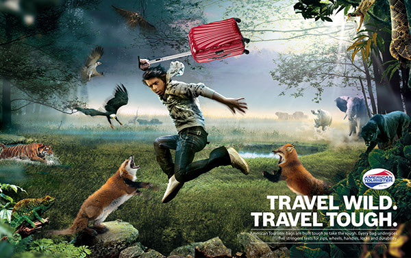
The first one is just a bunch of luggage in front and behind are the iconic buildings all over the world. The second one is a girl with a luggage walking around the globe with the iconic buildings around her, implying "Take on the world". But these were too simple so I wanted to research more. So I googled luggage advertisements and these were my favourites:


(http://th00.deviantart.net/fs70/PRE/f/2010/300/c/c/samsonite___b_lite_by_he1z-d31mfiy.jpg)


(http://adsoftheworld.com/sites/default/files/images/mwdlsytarmac72aotw.jpg)


(http://www.jaunted.com/files/22421/2010_07_23_JA___CosmoliteAd.jpg)


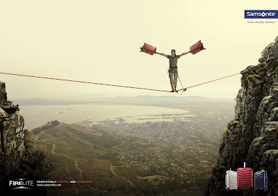
(https://blogger.googleusercontent.com/img/b/R29vZ2xl/AVvXsEgI5kdx3LBgYEDwhrgZHRt6pr-zib8KgrJvm-ra9Wu79dMfTbCB6qnJniQr_WY65cNOXIg0rVDvnfT-pSgUsdNknjltmNxbdzf67ENUE0pIKC14aemvqRd-SE1EqMnx6iR8dC9LXcJbW0JC/s1600/samsonite.jpg)

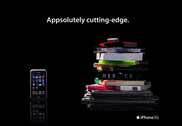
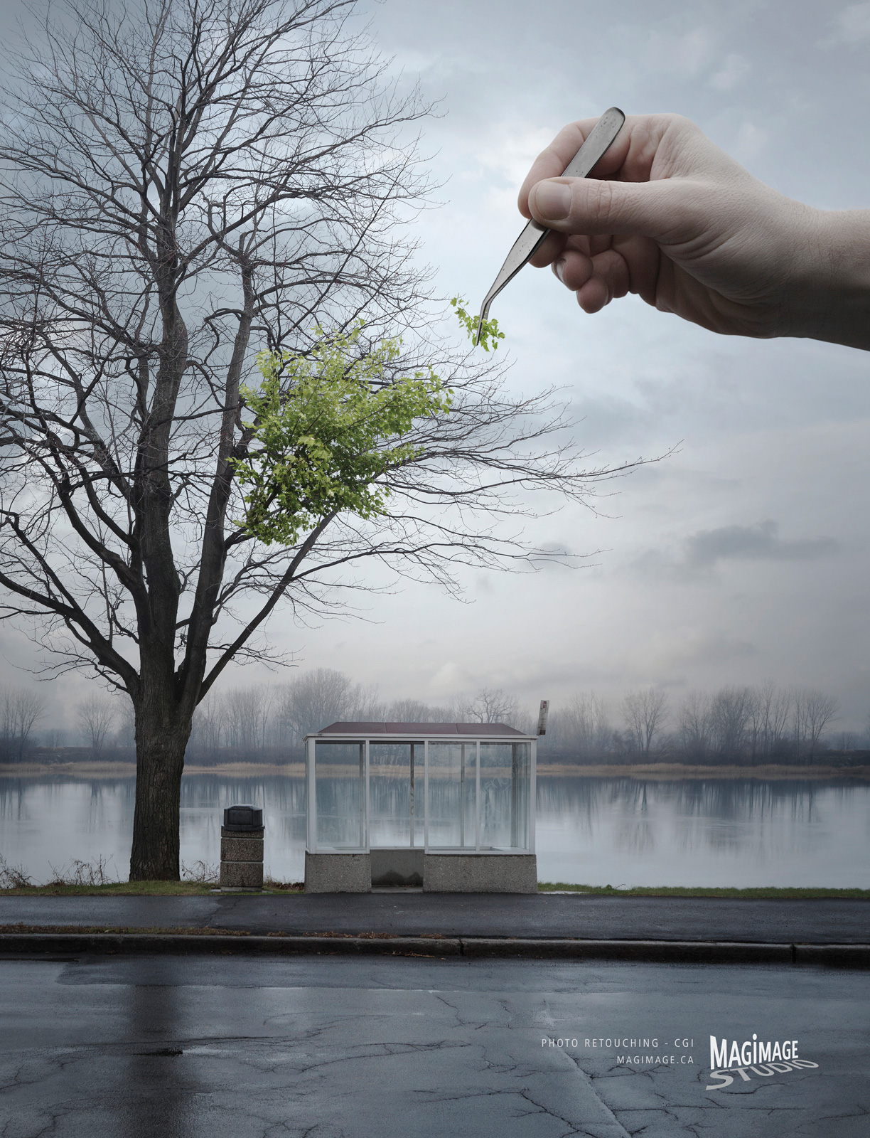
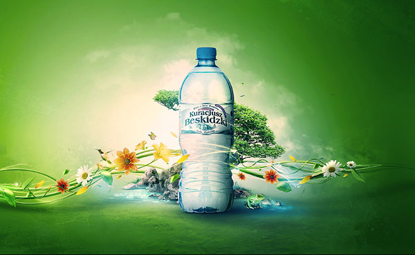
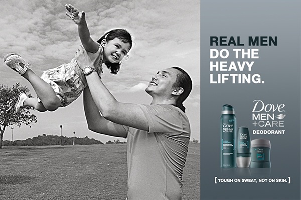
Samsonite are really creative with their advertisements I was really impressed!! Feeling inspired, I finally thought of the main purpose of the advertisement which is: Promoting a light weight luggage that anyone can travel easily with. From there, I researched more on lightweight things such as feathers, wings, kites and balloons. At first I thought kites were a good idea:


A man is flying a luggage which is supposed to be a kite, this says that the luggage is as light as a kite. Behind him is again the iconic buildings. I thought it was really weird but form there, I was motivated to create more ideas. Thinking of all the vibrant colours used in the first photo of this blogpost, I was suddenly reminded of the movie UP:
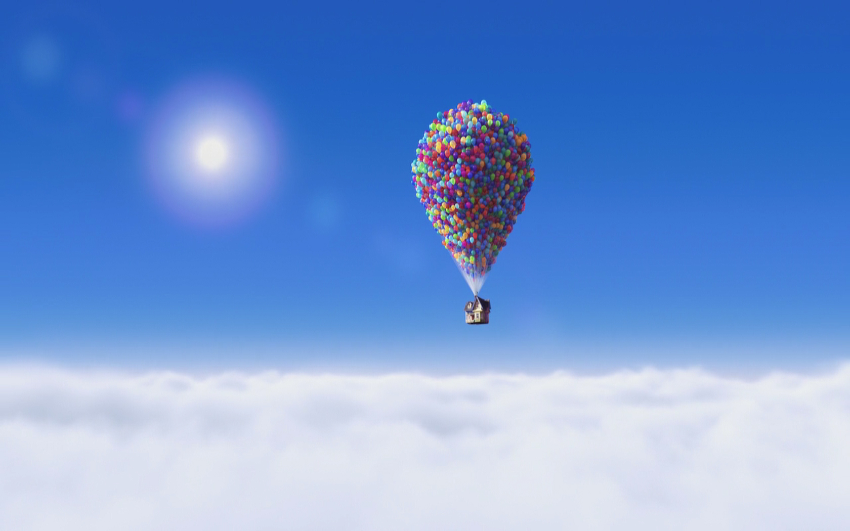

BAM!
 HOT AIR BALLOONS! 

(http://gomighty.com/wp-content/themes/gomighty/lib/goal_images/files/Hot-Air-Balloon.jpg)

(http://upload.wikimedia.org/wikipedia/commons/c/c0/Hot_air_balloon_over_Brisbane.jpg)

Instead of a balloon, it would be a whole load of colourful luggage instead! It shows how the luggage is so lightweight it can fly around the world!  Yes it does sound weird but I think it's good to explore beyond normal and simple! I'm still not sure of the landscape and scenery but I'm a step closer now. There are 3 ideas:
- different iconic buildings 
- one country for example Sweden
- simply mountains and grass
MAYBE IT'LL FLY OVER NIAGARA FALLS *GASP*
 
(http://www.amazingplacesonearth.com/wp-content/uploads/2012/12/Niagara-Falls-USA.jpg)


I might change the headline if I can think of a better one but this is what I'm hoping to achieve. HOPEFULLY, I will be able to photoshop & illustrate my ways to create the ideal advertisement. I will definitely do my best and learn new skills to help me get through this assignment. 

I want to pass with flying balloons!!

(http://cdn.c.photoshelter.com/img-get/I0000m8cQLfn1gNQ/s/850/850/20121008-nm-tex-0360.jpg)

Wednesday, May 28, 2014

Typography


screenshot


screenshot

(http://designshack.net/articles/typography/60-absolutely-stunning-typography-projects/)

On Tuesday's lesson, I learnt about typography and its basic functions!
What is typography? Typography is the art and technique of arranging type, type design, and modifying type glyphs. All forms of writing are typography. There are 8 rules for creating effective typography.

#1. Learn the basics
Typeface involves very specific jargon, general standards and precise measurements. You can only get away with breaking a rule if you know it well enough and are doing it intentionally.


#2. Watch your k e r n i n g
Adjusting the spaces between two letters are called kerning. This means I can edit each letter individually.

#3. Be aware of font communication
When selecting a font, I must be sure that the font will be suitable with the word. I can't pick out any font carelessly as this wont produce an effective result.

(http://designshack.net/wp-content/uploads/TypeMasculinity-9.jpg)

#4. Alignment
Beginners usually just center align everything due to thinking balance produces the best result which is completely wrong. Alignment is an extremely important concept and should be used selectively.

#5. Choose a good secondary font
After choosing the main typeface, I will have to choose another font that will complement it well. I will avoid using fonts that conflicts with the primary font.

screenshot
(http://designshack.net/articles/inspiration/100-awesome-logos-with-script-typography/)

#6: Size matters
The headlines are essential to grab the reader's attention instantly as there's limited time. To do this, dealing with the different sizes of the words will definitely attract them.

#7. Use typography as art
Typography are not simply headlines and body copy. There are design elements to it and it can be meticulously designed as meaningful art. It can be a valuable asset to my design arsenal.


#8. Find good inspiration
Inspiration comes from everywhere and it's best to study some existing examples for more ideas. Keep a lookout for inspiration.

GOOD TYPOGRAPHY: 
Good typography should be appealing to a person's eye such as big sizes, colour contrast and many more. The typography must be clear for us to understand quickly. It's supposed to give meaning to the advert. By using it as art, it make the whole advert design even more attractive and unique.


This is definitely a unique typography from IKEA. It is simple and fun. The words of "Coffee table" are misspelled as "Cfofee tbale" to imply that you can build the table your own, just as how you had to rearrange the letters correctly. The copy "Make Home Fun" just states how fun it can be to build your own furniture at your own house. The typography is fun and easy to understand. It definitely grabs a person's attention as the size are big and the colour contrasts against the white background. The misspelled words will catch someone's eye. Overall, the typography is flawless.

(https://blogger.googleusercontent.com/img/b/R29vZ2xl/AVvXsEitmMtd4wovDOvsvROko5DDJjZPzSmiwHbM9NyaE8ozmWNV12Gm4zV42LTIqNDRPL_85Ik9oguIAhyphenhyphenqJmtPeASf_zDrSvR7XTeQ_MnanNlNR1TVaTxzk2QK_Jqq86L8977d9ixtjJdm3JD6/s1600/typographic-print-ad-03.jpg)

Using a lemon as a typography for a Coco Cola Light Lemon drink is absolutely genius. It is simple, unique and creative. The lemon is cut perfectly to recreate Coco Cola's "C". With one glance at the advert, I can already tell that this is selling Coco Cola lemon flavour. Overall a wonderful typography!


BAD TYPOGRAPHY:
There's nothing much to say. Bad typography is simply bad typography. It isn't clear with what it's trying to say, it gives the wrong meaning to the advert, the colours and fonts are wrong, the message is bad and pretty much everything is bad. It will definitely not appeal to anyone and will fail to help sell the product in the advertisement.


(https://blogger.googleusercontent.com/img/b/R29vZ2xl/AVvXsEgPl5CPCFmQt_l_Qgs2AUr0ONQJ-3gxvuGVqIzfNbxZJLcYbBHZ5stvMi-3DOcXgTNj7YeMimeRc6cKcILWt61lCKaXJq3Q0Uo_fN7Z4Qd2i3u1xH1U9g0XL3FpDWkEI8d7KViioedhQ3E/s1600/bad+type+2.jpg)

This is inevitably a bad typography. The spelling is horrible and the different sizes of letters makes the whole thing even more horrendous. It is also really rude to use "Oi" and it'll make anyone not want to do anything with it. It has no meaning and won't grab anyone's attention at all. Typography like this is a failure and I will take note not to ever do this.

(http://typophile.com/files/bad%20type%203_5210.jpg)

There is no space between "Kids" and "exchange" so it implies another meaning. There's too many colours and it hurts my eye. Definitely a bad typography. 

Sunday, May 25, 2014

Photoshop Lesson 2

In the second lesson of photoshop, I learnt more useful tools an function such as the clipping mask, layer masks, natural healing, liquify, replace colour, colour range and colour replacement tool.

1. Layer modes: There are three layers of this file - the man, the suit and a pattern. By using clipping mask, I was able to map the pattern on the suit. Then, I blend it out with overlay to make the suit look more realistic.


2. Layer Masks: Using the layer mask can create an effect where only Shakira is n focus and the background is blurred out. I can hide the portions I want or make it visible. 


3. Healing Brush: To erase her moles and freckles away, I used the healing brush tool! I simply click on the good part of her skin and click on her mole to "heal" it. It will immediately disappear!


4. Expressions: Using liquify, I changed his stoic expression to a happy one! I pulled his eyebrows and mouth upwards. I tried my best to make it look as natural as possible :') 


5. Patching and cloning: These tools are for making a face look flawless. I used the patch tool to draw around the woman's wrinkles. By dragging it form the patch area to a clean part of her skin, I can erase her wrinkles, effectively making her look younger. 


I used cloning for this picture to clone her eye and lips. It was very funny and interesting to do this!


6: Replace Colour: I used replace colour to change the colour of the purple building to a pink colour. It was an easy process!


7. Colour Replacement Tool: This tool can change the colour of the woman's blouse without affecting any creases or folds on the blouse, looking natural. 


The last part of the lesson was just a short practice of the tools we learnt in photoshop. I changed the brightness and contrast of the sky and made reflections of the cat and sky. The reflection of the tray was difficult as I had to use the pen tool to cut it out but I managed it, although crooked, so the outcome looks alright! :) I liquified the cat's eyes to make it just a tad bigger. I put in a "meow" and below is the final result! 


Wednesday, May 21, 2014

Basic Elements of Print Ad

I learnt many design strategies for this lesson. There are four basic elements of a print advertisement: Visual, Headline, Body Copy and Logo. I understand that I must know what's the elements before beginning on the layout and design.

Keeping the layout simple is a very basic design strategy such as the Ogilvy Formula. Visuals on the top that are bleed to the edge of the page, caption below, headline next, an ad copy and finally the signature in the lower right corner.


(http://www.gutewerbung.net/wp-content/uploads/2013/03/Nissan-Cube-Symmetry-sucks-3.jpg)


(https://m1.behance.net/rendition/modules/39679685/disp/ecc5eb70e659c649805a9f433e38f83d.jpg)

The different principle of designs definitely applies to the design! For example balance (symmetrical and asymmetrical) 


(http://gdj.gdj.netdna-cdn.com/wp-content/uploads/2010/07/poster-designs-22.jpg)

Next is contrast which uses different shapes, type, lines, sizes, images and figures which captures the eye. This is to emphasize the key points you want to show. 


(commissionedwriting.com)

By using proportion, we are able to create emphasis on important ideas or figures. I can do this by making the key points larger, bolder, striking, basically different from the rest of the elements of the advertisement.


(http://tyneesh.files.wordpress.com/2011/01/proportion_21.png)

(http://williamaaronkelly.files.wordpress.com/2012/01/magimage_arbre_adsoftheworld.jpeg)

Those are the basic design strategies to keeping the layout simple. To step up my game, I can use a variety to make my advertisement even more interesting instead of a mirror-like symmetry type of design. I will carefully select the backgrounds and I can use the golden rectangle. These are the advanced design strategies. The grouping strategy is by using similar shapes, sizes, colours and textures. It can merge ideas in one, twos or threes  by finding relationships and making them obvious. 

When talking about colour, it is best to avoid black and white as it is boring (depends on the concept of the ad). Colours are exciting and there are different meanings to each. Colours are able to create desired emotions such as passion, peace and love. Harmonizing, balancing and contrasting colours will make the advertisement pop out. 


(http://slodive.com/wp-content/uploads/2012/06/creative-advertisement-posters/my-advocacy-ads.jpg)

Photo design and layout strategies are centered on two ideas which are making the mind group things to increase communicability, and bring items in and out of focus to emphasize importance. I must take note the best proportion, details, central points, linkage and point of view of the before taking a photo. Having too many ideas might be too much for the photo so it's best to cling to only one idea: Using the rule of thirds, use shadows and light, and play around with various kinds of lighting. 
The things to avoid while taking a shot would definitely be harsh shadows and gimmicky background (ripples, crumpled folds, busy patterns) as it may be a distraction and the central idea would lose focus. Background colour such as gray or black is also important as it can act as a contrast. By using visual stepping stones, it can capture a person's eye to the inner details of the photo. Framing the photos with objects or shooting on location gets a greater sense of reality.
When cropping photos, using principles of "closure" will carefully plan fashion shots. It is recommended to shot the product as if you are in love with them. It just makes the photo even better. If people are included in photos of products, they should be able to show the right facial expression needed in the photo. 


(http://media-cache-ec0.pinimg.com/736x/c9/7d/39/c97d393645742186b3005618696dc223.jpg)


(bonesi.blogspot.com)

(http://files2.coloribus.com/files/adsarchive/part_1504/15041405/file/pilot-pens-pen-fashion-poster-600-27719.jpg)


(https://m1.behance.net/rendition/modules/67095969/disp/ba65e691dadd20407096ce6a29fd7eb2.jpg)


(http://webneel.com/daily/sites/default/files/images/project/olumpus-optical-zoom-ads-2.jpg)

Those are the basic elements of a print advertisement! I will make sure to use the principles of design and the various strategies for my assignment 2. I will also take note to keep the purpose of the ad in mind as that is the most crucial part.