(http://samlaverycdf.files.wordpress.com/2011/11/scanned-image1.jpeg)
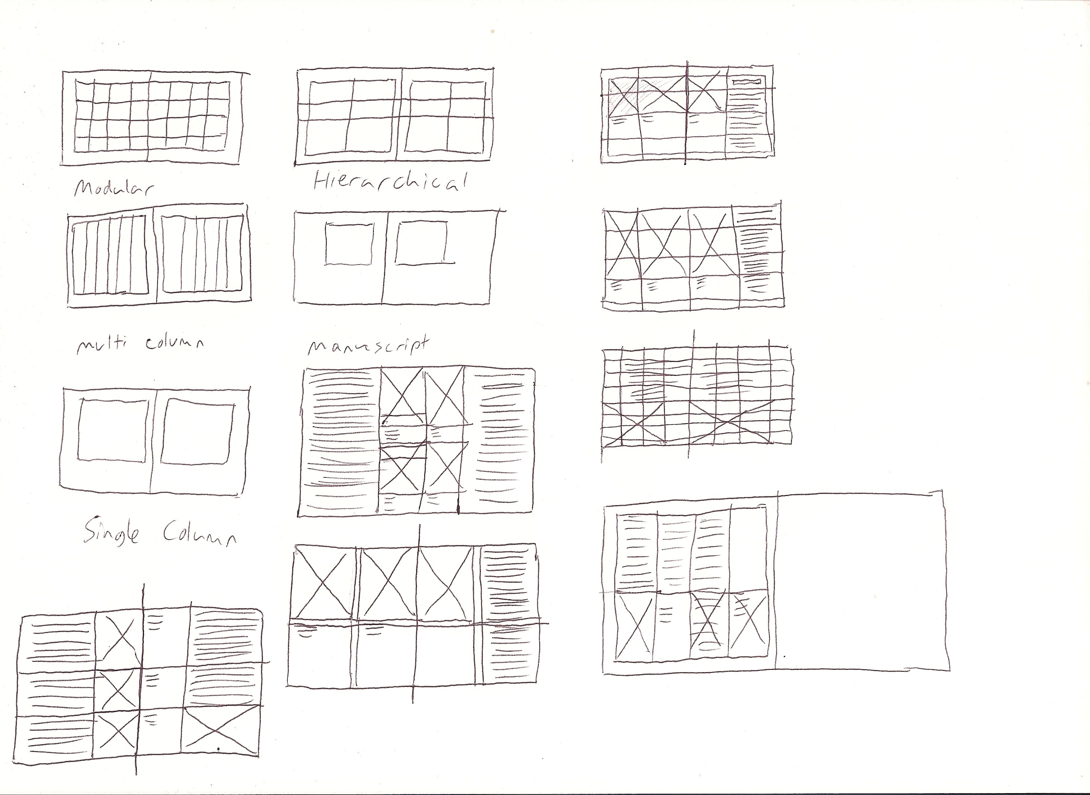
There are a few simple steps to designing a grid system from scratch. First step is to simply start with a blank canvas of A4 size. Next is subdividing ratios. The simplest grid system would be the modular grid.

(http://dav31d.files.wordpress.com/2012/03/multicolumn-grid.jpg)
To achieve something like that, I have to use a ratio of 1:1414 based on continuous division of the paper size. Elements within the design will have a relationship to one another by using the size as a guide. This is definitely one of the easiest ways to create a balanced grid. By simply layering division by division, the grid is slowly built as shown below.

Many have complained how grid systems stops the growth of creativity but the grids are actually facilitating creativity by providing a framework and answering designers frequently asked questions such as "how wide should the measurement be" and so on. A well designed grid can answer these questions without a doubt.
The grid is finally done so now I can begin to experiment with type areas, shapes and composition. Based on the pages my newsletter will have, I can explore how the type and image will work together.

So, these steps are to create a basic modular grid system. Moving on, I learnt the steps of creating a more complex grid such as the Star Diagram.

(http://pamwright99.files.wordpress.com/2012/05/goldensectiona4spread.png)

Unlike the modular grid, this grid is applied to a double paged spread instead of a single page. This is also known as an asymmetrical grid as opposed to the symmetrical grid in the beginning. For this grid, the ratio of the page is used to define the main text, content or area of the pages. The content area is divided by using the Golden Section ratio.
When the columns are done, creating the system is the next step. To flesh out the grid to allow it to cope with various content and page types, extending the lines of the content area and columns will do the trick. Then, just apply a horizontal rule cutting across the content area creation lines which gives the reader a line to rest their eyes on page after page. By using the extended lines, now it is possible to add areas for the access structure of the book which typically sit outside of the content area with plenty of white space around them.
Finally, add the various designs to the grid with a reassuring thought that all individual elements of the design (text, images, etc) will have a relationship to each other.
Therefore, creating grid systems these way, despite confusing and time-consuming, ensures a balanced grid. But, the grid can always be played around with to make it exciting and fun.
No comments:
Post a Comment