For any newspaper or newsletter, it is important to grab the reader's attention hence the first page must be appealing. Loud headlines, huge photos, juicy and interesting stories and a good amount of splashy and bright colours would help attract people to buy the newsletters. Below are some examples!
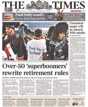
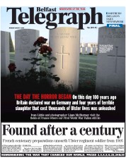
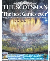
(http://www.thepaperboy.com/uk/front-pages.cfm)

(http://inspirationhut.net/inspiration/42-excellent-examples-of-magazine-layout-design-for-your-inspiration/)
Besides that, there are also different types of photos and its guidelines. Horizontal, vertical and square are the 3 basic shapes of photos. Horizontal is the most common because we view the world horizontally with our own eyes. Vertical is complex to design but it is definitely more powerful and dynamic. The most boring would be the square so it is best to avoid this. Nonetheless, I shouldn't focus so much on the shapes as the content of the photo is the most important after all.


The layout on the right is indisputably better than the left one due to the different sizes and shapes of photos. The photos are all of the same sizes on the left layout which makes it simple and boring. I must also take note to give photos priority. The dominant photo will be the biggest among other competing photos to show its importance.
There are also some photo guidelines I should follow:
1) Every photo should have a clean, clear centre of interest
As a good photo is similar to a well written story, it should be easy to read and free of clutter. The important elements can stand out instantly if the photos are focused and cleanly composed.
2) Should look natural
In a professional snapshots, people are relaxed and natural as they engage in activities unlike amateur shots where they smile stiffly at the camera. It is best to shoot people doing real things, not acting to be busy or daydreaming.
3) Should get a cutline
Everything in the photo such as faces, places and activities, should be identified because readers might not know who is who or that they actually want to read the story. Avoid cutting out half of a person's face and cropped it out nicely.
4) Should be bordered
Framing each photo with a thin border doesn't allow white tones of the photo to float into the whiteness of a page.
5) Should be relevant
Photos are not to decorate the page but it is actually to provide information relating to the article.
6) Every face should be at least the size of a ten cent coin
Shooting crowds are not a good way if I want an image with impact. I should take shots of individuals instead.
Furthermore, cropping photos allows re-framing the image and creating a new shape that emphasize the importance.
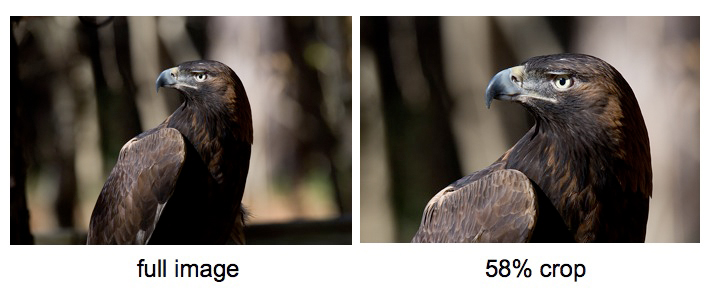
(http://www.digitalbirdphotography.com/photoshop/fundamentals/crop.jpg)
These pictures below are examples of how cropping can change the whole, original story. Wow, this is very unique and creative. It is an advertisement that will surely make a huge impact to people.
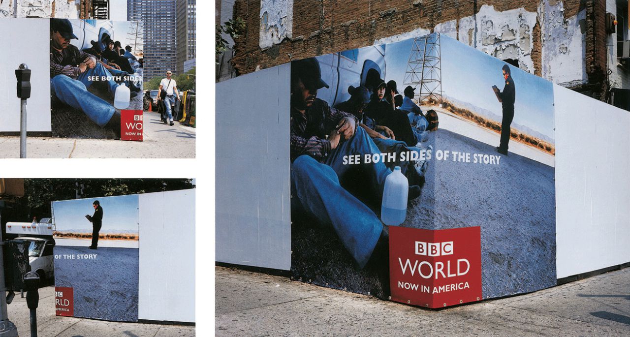
(http://creativecriminals.com/bbc/see-both-sides-of-the-story)

What else?
There are also more things that I can add besides text and pictures to accompany the story to make it more visually interesting and appealing.
- Graphs
- Fast facts
- Quotes
- Ratings
- Timelines
- Step-by-step guides
- Infographics
- Maps
For the second part of the lesson, I worked in a group with Alicia, Jamie and Cheryl for our newsletter assignment! We planned on our topic and theme for the newsletter which is Interior Design! We chose this topic because we all find it very interesting and it'll be fun to create it on InDesign. I'm a bit nervous because I'm still not that good with InDesign but I will practice daily to achieve great results!
During our discussion time, we briefly learnt about Editorial Grid Systems. There are three different basic types of grids which are the manuscript,column and modular grids. At the end of the lesson, we were given examples of the grid layouts and we found it very helpful.
We will definitely research online for more inspiration!
No comments:
Post a Comment